Symfony UX TogglePassword
Symfony UX TogglePassword 是一個 Symfony 套件,為 Symfony 表單中的密碼輸入欄位提供可見性切換功能。它是 Symfony UX 計畫的一部分。
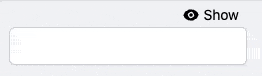
它允許訪客將密碼欄位的類型切換為文字,反之亦然。
安裝
注意
在開始之前,請確保您的應用程式中已設定 StimulusBundle。
使用 Composer 和 Symfony Flex 安裝套件
1
$ composer require symfony/ux-toggle-password如果您使用 WebpackEncore,請安裝您的 assets 並重新啟動 Encore (如果您使用 AssetMapper 則不需要)
1
2
$ npm install --force
$ npm run watch
搭配 Symfony 表單使用
任何 PasswordType 都可以透過新增 toggle 選項轉換為切換密碼欄位
1
2
3
4
5
6
7
8
9
10
11
12
13
14
15
16
// ...
use Symfony\Component\Form\Extension\Core\Type\PasswordType;

class CredentialFormType extends AbstractType
{
    public function buildForm(FormBuilderInterface $builder, array $options)
    {
        $builder
            // ...
            ->add('password', PasswordType::class, ['toggle' => true])
            // ...
        ;
    }

    // ...
}
預設情況下會啟用自訂表單主題,將 widget 包裹在 <div class="toggle-password-container"> 中。您可以將 use_toggle_form_theme 選項設定為 false 來停用它
1
2
3
4
5
6
7
8
9
10
11
12
13
14
15
16
// ...
use Symfony\Component\Form\Extension\Core\Type\PasswordType;

class CredentialFormType extends AbstractType
{
    public function buildForm(FormBuilderInterface $builder, array $options)
    {
        $builder
            // ...
            ->add('password', PasswordType::class, ['toggle' => true, 'use_toggle_form_theme' => false])
            // ...
        ;
    }

    // ...
}
注意
注意:如果您選擇停用提供的套件表單主題,您將必須自行處理樣式。
自訂標籤和圖示
該欄位預設使用「顯示」和「隱藏」文字,以及來自 Heroicons 的 SVG 圖示作為切換按鈕。您可以透過將 hidden_label、visible_label、hidden_icon 和 visible_icon 選項傳遞給欄位來自訂它們 (使用 null 停用標籤或圖示)
1
2
3
4
5
6
7
8
9
10
11
12
13
14
15
16
17
18
19
20
21
22
// ...
use Symfony\Component\Form\Extension\Core\Type\PasswordType;

class CredentialFormType extends AbstractType
{
    public function buildForm(FormBuilderInterface $builder, array $options)
    {
        $builder
            // ...
            ->add('password', PasswordType::class, [
                'toggle' => true,
                'hidden_label' => 'Masquer',
                'visible_label' => 'Afficher',
                'visible_icon' => null,
                'hidden_icon' => null,
            ])
            // ...
        ;
    }

    // ...
}
注意
注意:標籤選項都支援翻譯。您可以使用翻譯鍵字串 (並使用 toggle_translation_domain 選項提供翻譯網域) 或 Symfony\Component\Translation\TranslatableMessage 物件。將 false 傳遞給 toggle_translation_domain 選項將停用標籤的翻譯。
自訂設計
套件提供預設樣式表以簡化使用。您可以停用它,以便在需要時新增自己的設計。
在 assets/controllers.json 中,將 @symfony/ux-toggle-password/dist/style.min.css 的自動匯入切換為 false 以停用預設樣式表
1
2
3
4
5
6
7
8
9
10
11
12
13
14
{
    "controllers": {
        "@symfony/ux-toggle-password": {
            "toggle-password": {
                "enabled": true,
                "fetch": "eager",
                "autoimport": {
                    "@symfony/ux-toggle-password/dist/style.min.css": false
                }
            }
        }
    },
    "entrypoints": []
}
注意
注意:您應該將值設定為 false,而不是移除該行,這樣 Symfony Flex 未來才不會嘗試再次新增該行。
完成後,將不再使用預設樣式表,您可以基於 TogglePassword 實作自己的 CSS。
您也可以僅透過覆寫預設類別來自訂特定的 TogglePassword 元素。使用 button_classes 選項為切換元素新增自訂類別名稱。toggle_container_classes 選項也可用於自訂容器表單主題元素
1
2
3
4
5
6
7
8
9
10
11
12
13
14
15
16
17
18
19
20
// ...
use Symfony\Component\Form\Extension\Core\Type\PasswordType;

class CredentialFormType extends AbstractType
{
    public function buildForm(FormBuilderInterface $builder, array $options)
    {
        $builder
            // ...
            ->add('password', PasswordType::class, [
                'toggle' => true,
                'button_classes' => ['btn', 'primary', 'my-custom-class'],
                'toggle_container_classes' => ['input-group-text', 'my-custom-container'],
            ])
            // ...
        ;
    }

    // ...
}
擴展預設行為
如果您需要從 JavaScript 進行額外控制,您可以利用此套件發送的一些事件
1
2
3
4
5
6
7
8
9
10
11
12
13
14
15
16
17
18
19
20
21
22
23
24
25
26
27
28
29
30
31
32
33
34
35
36
37
38
39
40
41
42
43
44
45
46
47
48
49
50
51
// assets/controllers/my-toggle-password_controller.js

import { Controller } from '@hotwired/stimulus';

export default class extends Controller {
    connect() {
        this.element.addEventListener('toggle-password:connect', this._onConnect);
        this.element.addEventListener('toggle-password:show', this._onShow);
        this.element.addEventListener('toggle-password:hide', this._onHide);
    }

    disconnect() {
        // You should always remove listeners when the controller is disconnected to avoid side-effects
        this.element.removeEventListener('toggle-password:connect', this._onConnect);
        this.element.removeEventListener('toggle-password:show', this._onShow);
        this.element.removeEventListener('toggle-password:hide', this._onHide);
    }

    _onConnect(event) {
        // The TogglePassword was just created.
        // You can for example add custom attributes to the toggle element
        const toggle = event.detail.button;
        toggle.dataset.customProperty = 'my-custom-value';

        // Or add a custom class to the input element
        const input = event.detail.element;
        input.classList.add('my-custom-class');
    }

    _onShow(event) {
        // The TogglePassword input has just been toggled for text type.
        // You can for example add custom attributes to the toggle element
        const toggle = event.detail.button;
        toggle.dataset.visible = true;

        // Or add a custom class to the input element
        const input = event.detail.element;
        input.classList.add('my-custom-class');
    }

    _onHide(event) {
        // The TogglePassword input has just been toggled for password type.
        // You can for example update custom attributes to the toggle element
        const toggle = event.detail.button;
        delete toggle.dataset.visible;

        // Or remove a custom class to the input element
        const input = event.detail.element;
        input.classList.remove('my-custom-class');
    }
}
然後在您的表單中,將您的控制器新增為 HTML 屬性
1
2
3
4
5
6
7
8
9
10
11
12
13
14
15
16
17
18
19
// ...
use Symfony\Component\Form\Extension\Core\Type\PasswordType;

class CredentialFormType extends AbstractType
{
    public function buildForm(FormBuilderInterface $builder, array $options)
    {
        $builder
            // ...
            ->add('password', PasswordType::class, [
                'toggle' => true,
                'attr' => ['data-controller' => 'my-toggle-password'],
            ])
            // ...
        ;
    }

    // ...
}
不搭配 Symfony 表單使用
您也可以將 TogglePassword 與原生 HTML 輸入欄位搭配使用。在 stimulus_controller() 函式中,您可以使用與先前章節中相同的選項來自訂標籤和圖示
1
2
3
4
5
6
7
8
9
10
11
12
13
14
15
16
17
18
19
20
21
22
{# ... #}

{# add "toggle-password-container" or a class that applies "position: relative" to this container #}
<div class="toggle-password-container">
    <label for="password">Password</label>
    <input
        id="password"
        name="password"
        type="password"
        {{ stimulus_controller('symfony/ux-toggle-password/toggle-password', {
            visibleLabel: 'Show password',
            visibleIcon: 'Name of some SVG icon',
            hiddenLabel: 'Hide password',
            hiddenIcon: 'Name of some SVG icon',
            # you can add your own CSS classes if needed, but the following
            # CSS class is required to activate the default styles
            buttonClasses: ['toggle-password-button'],
        }) }}
    >
</div>

{# ... #}
向下相容性承諾
此套件旨在遵循與 Symfony 框架相同的向下相容性承諾:https://symfony.dev.org.tw/doc/current/contributing/code/bc.html