Twig 組件
Twig 組件讓您能夠將物件綁定到範本,使其更容易渲染和重複使用小的範本「單元」 - 像是「警示」、modal 的標記或類別側邊欄
每個組件都包含 (1) 一個類別
1
2
3
4
5
6
7
8
9
10
11
// src/Twig/Components/Alert.php
namespace App\Twig\Components;

use Symfony\UX\TwigComponent\Attribute\AsTwigComponent;

#[AsTwigComponent]
class Alert
{
    public string $type = 'success';
    public string $message;
}
以及 (2) 一個範本
1
2
3
4
{# templates/components/Alert.html.twig #}
<div class="alert alert-{{ type }}">
    {{ message }}
</div>
完成!現在在任何您想要的地方渲染它
1
2
3
{{ component('Alert', {message: 'Hello Twig Components!'}) }}

<twig:Alert message="Or use the fun HTML syntax!" />
享受您的新組件!
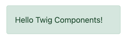 Alert 組件範例
這將來自客戶端框架熟悉的「組件」系統帶入 Symfony。將其與 Live Components 結合使用,以建立具有自動、Ajax 驅動渲染的互動式前端。
想要示範嗎?請查看 https://ux.symfony.com/twig-component#demo
安裝
讓我們安裝它!執行
1
$ composer require symfony/ux-twig-component就是這樣!我們準備好了!如果您沒有使用 Symfony Flex,請新增一個設定檔來控制組件的範本目錄
1
2
3
4
5
6
# config/packages/twig_component.yaml
twig_component:
    anonymous_template_directory: 'components/'
    defaults:
        # Namespace & directory for components
        App\Twig\Components\: 'components/'
組件基礎
讓我們建立一個可重複使用的「警示」元素,我們可以用它在整個網站上顯示成功或錯誤訊息。步驟 1 是建立一個組件類別並給它 AsTwigComponent 屬性
1
2
3
4
5
6
7
8
9
// src/Twig/Components/Alert.php
namespace App\Twig\Components;

use Symfony\UX\TwigComponent\Attribute\AsTwigComponent;

#[AsTwigComponent]
class Alert
{
}
這個類別在技術上可以放在任何地方,但在實務上,您會將它放在 config/packages/twig_component.yaml 中設定的命名空間下。這有助於 TwigComponent 命名您的組件並知道其範本的位置。
步驟 2 是建立範本。預設情況下,範本位於 templates/components/{component_name}.html.twig,其中 {component_name} 與組件的類別名稱相符
1
2
3
4
{# templates/components/Alert.html.twig #}
<div class="alert alert-success">
    Success! You've created a Twig component!
</div>
這還不是很有趣…因為訊息是硬編碼在範本中。但這已經足夠了!從任何其他 Twig 範本渲染您的組件來慶祝一下
1
{{ component('Alert') }}完成!您剛剛渲染了您的第一個 Twig 組件!您可以執行以下命令查看它和任何其他組件
1
$ php bin/console debug:twig-component花點時間握拳慶祝一下 - 然後回來!
提示
如果您使用 Symfony MakerBundle,您可以輕鬆地使用 make:twig-component 命令建立一個新的組件
1
$ php bin/console make:twig-component Alert命名您的組件
為了給您的組件命名,TwigComponent 會查看在 twig_component.yaml 中設定的命名空間並找到第一個匹配項。如果您有建議的 App\Twig\Components\,那麼
| 組件類別 | 組件名稱 |
|---|---|
App\Twig\Components\Alert |
Alert |
App |
Button:Primary |
: 字元在名稱中使用,而不是 \。請參閱設定以取得更多資訊。
除了讓 TwigComponent 選擇名稱之外,您也可以自己設定一個
1
2
3
4
#[AsTwigComponent('alert')]
class Alert
{
}
將資料 (Props) 傳遞到您的組件中
為了使我們的 Alert 組件可重複使用,我們需要訊息和類型(例如 success、danger 等)可配置。為此,請為每個屬性建立一個公共屬性
1
2
3
4
5
6
7
8
9
10
11
12
// src/Twig/Components/Alert.php
  // ...

  #[AsTwigComponent]
  class Alert
  {
+     public string $message;

+     public string $type = 'success';

      // ...
}在範本中,Alert 實例可透過 this 變數取得,而公共屬性可直接使用。使用它們來渲染兩個新屬性
1
2
3
4
5
6
<div class="alert alert-{{ type }}">
    {{ message }}

    {# Same as above, but using "this", which is the component object #}
    {{ this.message }}
</div>
我們如何填充 message 和 type 屬性?透過將它們作為「props」透過 component() 的第二個參數傳遞
1
2
3
4
5
6
{{ component('Alert', {message: 'Successfully created!'}) }}

{{ component('Alert', {
    type: 'danger',
    message: 'Danger Will Robinson!'
}) }}
在幕後,將會實例化一個新的 Alert,並且 message 鍵(以及 type,如果傳遞)將會設定到物件的 $message 屬性上。然後,組件被渲染!如果屬性具有 setter 方法(例如 setMessage()),則會調用該方法而不是直接設定屬性。
注意
您可以停用公開組件的公共屬性。停用後,必須使用 this.property
1
2
3
4
5
#[AsTwigComponent(exposePublicProps: false)]
class Alert
{
    // ...
}
傳遞和渲染屬性
如果您傳遞的額外 props 無法在您的組件類別上設定,則可以將它們渲染為屬性
1
2
3
4
{{ component('Alert', {
    id: 'custom-alert-id',
    message: 'Danger Will Robinson!'
}) }}
若要渲染屬性,請使用每個組件範本中可用的特殊 attributes 變數
1
2
3
<div {{ attributes.defaults({class: 'alert alert-' ~ type}) }}>
    {{ message }}
</div>請參閱組件屬性以了解更多資訊。
組件範本路徑
如果您使用預設設定,則範本名稱將為:templates/components/{component_name}.html.twig,其中 {component_name} 與組件名稱相符。
| 組件名稱 | 範本路徑 |
|---|---|
Alert |
templates/components/Alert.html.twig |
Button:Primary |
templates/components/Button/Primary.html.twig |
名稱中的任何 : 都會變更為子目錄。
您可以透過 AsTwigComponent 屬性控制使用的範本
1
2
3
4
5
6
// src/Twig/Components/Alert.php
  // ...

- #[AsTwigComponent]
+ #[AsTwigComponent(template: 'my/custom/template.html.twig')]
class Alert您也可以為整個命名空間設定預設範本目錄。請參閱設定。
組件 HTML 語法
到目前為止還不錯!為了使 Twig 組件的使用更加方便,它帶有類似 HTML 的語法,其中 props 作為屬性傳遞
1
<twig:Alert message="This is really cool!" withCloseButton />這會將 message 和 withCloseButton (true) props 傳遞到 Alert 組件並渲染它!如果屬性是動態的,請在屬性前加上 : 或使用正常的 {{ }} 語法
1
2
3
4
5
6
7
<twig:Alert message="hello!" :user="user.id" />

// equal to
<twig:Alert message="hello!" user="{{ user.id }}" />

// pass object, array, or anything you imagine
<twig:Alert :foo="{col: ['foo', 'oof']}" />
布林值 props 使用 PHP 的類型轉換規則轉換。「false」字串會轉換為布林值 true。
若要傳遞布林值 false,您可以傳遞 Twig 表達式 {{ false }} 或使用動態語法(帶有 : 字首)
1
2
3
4
5
6
7
8
{# ❌ the string 'false' is converted to the boolean 'true' #}
<twig:Alert message="..." withCloseButton="false" />

{# ✅ use the 'false' boolean value #}
<twig:Alert message="..." withCloseButton="{{ false }}" />

{# ✅ use the dynamic syntax #}
<twig:Alert message="..." :withCloseButton="false" />
別忘了您可以將 props 與您想要在根元素上渲染的屬性混合搭配
1
<twig:Alert message="hello!" id="custom-alert-id" />若要傳遞屬性陣列,請使用 {{...}} 展開運算符語法。這需要 Twig 3.7.0 或更高版本
1
<twig:Alert {{ ...myAttributes }} />在本指南的剩餘部分,我們將使用 HTML 語法。
將 HTML 傳遞到組件
除了將 message prop 傳遞到 Alert 組件之外,如果我們可以這樣做呢?
1
2
3
<twig:Alert>
    I'm writing <strong>HTML</strong> right here!
</twig:Alert>
我們可以!當您在 <twig:Alert> 開啟和關閉標籤之間新增內容時,它會作為名為 content 的區塊傳遞到您的組件範本。您可以像任何普通區塊一樣渲染它
1
2
3
<div {{ attributes.defaults({class: 'alert alert-' ~ type}) }}>
    {% block content %}{% endblock %}
</div>您甚至可以為區塊提供預設內容。請參閱透過區塊將 HTML 傳遞到組件以取得更多資訊。
在組件中使用巨集
在組件內定義內容效果很好,但如果您想在組件內使用巨集怎麼辦?好消息:您可以!但有一個問題:您不能使用 _self 關鍵字匯入巨集。相反,您需要使用定義巨集的範本的完整路徑
1
2
3
4
5
6
7
8
9
10
11
12
13
{% macro message_formatter(message) %}
    <strong>{{ message }}</strong>
{% endmacro %}

<twig:Alert>
    {# ❌ this won't work #}
    {% from _self import message_formatter %}

    {# ✅ this works as expected #}
    {% from 'path/of/this/template.html.twig' import message_formatter %}

    {{ message_formatter('...') }}
</twig:Alert>
獲取服務
讓我們建立一個更複雜的範例:「精選產品」組件。您可以選擇將 Product 物件陣列傳遞到組件並將它們設定在 $products 屬性上。但相反,讓我們讓組件完成執行查詢的工作。
如何做到?組件是服務,這表示自動裝配像平常一樣運作。此範例假設您有一個 Product Doctrine 實體和 ProductRepository
1
2
3
4
5
6
7
8
9
10
11
12
13
14
15
16
17
18
19
// src/Twig/Components/FeaturedProducts.php
namespace App\Twig\Components;

use App\Repository\ProductRepository;
use Symfony\UX\TwigComponent\Attribute\AsTwigComponent;

#[AsTwigComponent]
class FeaturedProducts
{
    public function __construct(private ProductRepository $productRepository)
    {
    }

    public function getProducts(): array
    {
        // an example method that returns an array of Products
        return $this->productRepository->findFeatured();
    }
}
在範本中,可以透過 this.products 存取 getProducts() 方法
1
2
3
4
5
6
7
8
{# templates/components/FeaturedProducts.html.twig #}
<div>
    <h3>Featured Products</h3>

    {% for product in this.products %}
        ...
    {% endfor %}
</div>
由於此組件沒有任何我們需要填充的公共屬性,因此您可以使用以下方式渲染它
1
<twig:FeaturedProducts />注意
由於組件是服務,因此可以使用正常的依賴注入。但是,每個組件服務都以 shared: false 註冊。這表示您可以安全地使用不同的資料多次渲染相同的組件,因為每個組件都將是一個獨立的實例。
掛載資料
大多數時候,您會建立公共屬性,然後在渲染時將值作為「props」傳遞給這些屬性。但是,如果您需要執行更複雜的操作,則可以使用多個 hook。
mount() 方法
為了更精確地控制如何處理您的「props」,您可以建立一個名為 mount() 的方法
1
2
3
4
5
6
7
8
9
10
11
12
13
14
15
16
// src/Twig/Components/Alert.php
// ...

#[AsTwigComponent]
class Alert
{
    public string $message;
    public string $type = 'success';

    public function mount(bool $isSuccess = true): void
    {
        $this->type = $isSuccess ? 'success' : 'danger';
    }

    // ...
}
mount() 方法僅被調用一次:在您的組件實例化後立即調用。由於該方法具有 $isSuccess 參數,因此如果我們在渲染時傳遞 isSuccess prop,它將被傳遞到 mount()。
1
2
3
4
<twig:Alert
    isSuccess="{{ false }}"
    message="Danger Will Robinson!"
/>
如果 prop 名稱(例如 isSuccess)與 mount() 中的參數名稱匹配,則該 prop 將作為該參數傳遞,並且組件系統將不會嘗試直接在屬性上設定它或將其用於組件 attributes。
PreMount Hook
如果您需要在資料掛載到組件之前修改/驗證資料,請使用 PreMount hook
1
2
3
4
5
6
7
8
9
10
11
12
13
14
15
16
17
18
19
20
21
22
23
24
25
26
27
// src/Twig/Components/Alert.php
use Symfony\UX\TwigComponent\Attribute\PreMount;
// ...

#[AsTwigComponent]
class Alert
{
    public string $message;
    public string $type = 'success';

    #[PreMount]
    public function preMount(array $data): array
    {
        // validate data
        $resolver = new OptionsResolver();
        $resolver->setIgnoreUndefined(true);

        $resolver->setDefaults(['type' => 'success']);
        $resolver->setAllowedValues('type', ['success', 'danger']);
        $resolver->setRequired('message');
        $resolver->setAllowedTypes('message', 'string');

        return $resolver->resolve($data) + $data;
    }

    // ...
}
注意
在其預設設定中,OptionsResolver 會處理所有 props。但是,如果傳遞的 props 多於 OptionsResolver 中定義的選項,則會提示錯誤,指示一個或多個選項不存在。為了避免這種情況,請使用 ignoreUndefined() 方法並設定為 true。請參閱忽略未定義的選項以取得更多資訊
1
$resolver->setIgnoreUndefined(true);此設定的主要缺點是 OptionsResolver 將在解析資料時移除每個未定義的選項。為了維護 OptionsResolver 中未定義的 props,請將 hook 中的資料與解析後的資料結合
1
return $resolver->resolve($data) + $data;從 preMount() 傳回的資料將用作掛載的 props。
注意
如果您的組件有多個 PreMount hook,並且您想控制它們的調用順序,請使用 priority 屬性參數:PreMount(priority: 10)(數字越大越先調用)。
PostMount Hook
在組件實例化且其資料掛載後,您可以透過 PostMount hook 執行額外程式碼
1
2
3
4
5
6
7
8
9
10
11
12
13
14
15
16
// src/Twig/Components/Alert.php
use Symfony\UX\TwigComponent\Attribute\PostMount;
// ...

#[AsTwigComponent]
class Alert
{
    #[PostMount]
    public function postMount(): void
    {
        if (str_contains($this->message, 'danger')) {
            $this->type = 'danger';
        }
    }
    // ...
}
PostMount 方法也可以接收一個陣列 $data 參數,其中將包含傳遞給組件但尚未處理的任何 props(即,它們不對應於任何屬性,也不是 mount() 方法的參數)。您可以處理這些 props,從 $data 中移除它們並傳回陣列
1
2
3
4
5
6
7
8
9
10
11
12
13
14
15
16
17
18
19
20
21
22
23
24
// src/Twig/Components/Alert.php
#[AsTwigComponent]
class Alert
{
    public string $message;
    public string $type = 'success';

    #[PostMount]
    public function processAutoChooseType(array $data): array
    {
        if ($data['autoChooseType'] ?? false) {
            if (str_contains($this->message, 'danger')) {
                $this->type = 'danger';
            }

            // remove the autoChooseType prop from the data array
            unset($data['autoChooseType']);
        }

        // any remaining data will become attributes on the component
        return $data;
    }
    // ...
}
注意
如果您的組件有多個 PostMount hook,並且您想控制它們的調用順序,請使用 priority 屬性參數:PostMount(priority: 10)(數字越大越先調用)。
匿名組件
有時組件非常簡單,不需要 PHP 類別。在這種情況下,您可以跳過類別並僅建立範本。組件名稱由範本的位置決定
1
2
3
4
{# templates/components/Button/Primary.html.twig #}
<button {{ attributes.defaults({class: 'primary'}) }}>
    {% block content %}{% endblock %}
</button>
此組件的名稱將為 Button:Primary,因為子目錄的原因
1
2
3
4
5
6
7
8
{# index.html.twig #}
...
<div>
   <twig:Button:Primary>Click Me!</twig:Button:Primary>
</div>

{# renders as: #}
<button class="primary">Click Me!</button>
像平常一樣,您可以傳遞將在元素上渲染的額外屬性
1
2
3
4
5
6
7
8
{# index.html.twig #}
...
<div>
   <twig:Button:Primary type="button" name="foo">Click Me!</twig:Button:Primary>
</div>

{# renders as: #}
<button class="primary" type="button" name="foo">Click Me!</button>
您也可以將變數 (prop) 傳遞到您的範本中
1
2
3
4
5
{# index.html.twig #}
...
<div>
    <twig:Button icon="fa-plus" type="primary" role="button">Click Me!</twig:Button>
</div>
為了告訴系統 icon 和 type 是 props 而不是屬性,請在範本頂部使用 {% props %} 標籤。
1
2
3
4
5
6
7
8
9
{# templates/components/Button.html.twig #}
{% props icon = null, type = 'primary' %}

<button {{ attributes.defaults({class: 'btn btn-'~type}) }}>
    {% block content %}{% endblock %}
    {% if icon %}
        <span class="fa-solid fa-{{ icon }}"></span>
    {% endif %}
</button>
透過區塊將 HTML 傳遞到組件
Props 不是您可以傳遞給組件的唯一方式。您也可以傳遞內容
1
2
3
<twig:Alert type="success">
    <div>Congratulations! You've won a free puppy!</div>
</twig:Alert>
在您的組件範本中,這會變成一個名為 content 的區塊
1
2
3
4
5
<div class="alert alert-{{ type }}">
    {% block content %}
        // the content will appear in here
    {% endblock %}
 </div>
您也可以新增更多具名的區塊
1
2
3
4
5
6
<div class="alert alert-{{ type }}">
    {% block content %}{% endblock %}
    {% block footer %}
        <div>Default Footer content</div>
    {% endblock %}
 </div>
以正常方式渲染這些區塊。
1
2
3
4
5
6
7
8
<twig:Alert type="success">
    <div>Congrats on winning a free puppy!</div>

    <twig:block name="footer">
        {{ parent() }} {# render the default content if needed #}
        <button class="btn btn-primary">Claim your prize</button>
    </twig:block>
</twig:Alert>
雖然透過 LiveComponents 也可以將內容傳遞到您的範本中,但有一些與變數範圍相關的注意事項需要了解。請參閱將區塊傳遞到 Live Components。
還有另一種非 HTML 語法可以使用
1
2
3
4
{% component Alert with {type: 'success'} %}
    {% block content %}<div>Congrats!</div>{% endblock %}
    {% block footer %}... footer content{% endblock %}
{% endcomponent %}
區塊內的上下文/變數
<twig:Component> 內的內容應被視為存在於其自己的獨立範本中,該範本擴展了組件的範本。這有一些有趣的後果。
首先,在 <twig:Component> 內,this 變數表示您現在正在渲染的組件,並且您可以存取該組件的所有變數
1
2
3
4
5
6
7
8
{# templates/components/SuccessAlert.html.twig #}
{{ this.someFunction }} {# this === SuccessAlert #}

<twig:Alert type="success">
    {{ this.someFunction }} {# this === Alert #}

    {{ type }} {# references a "type" prop from Alert #}
</twig:Alert>
方便的是,除了 Alert 組件的變數之外,您還可以存取原始範本中可用的任何變數
1
2
3
4
5
{# templates/components/SuccessAlert.html.twig #}
{% set name = 'Fabien' %}
<twig:Alert type="success">
    Hello {{ name }}
</twig:Alert>
來自上層組件(例如 SuccessAlert)的所有變數都可以在下層組件(例如 Alert)的內容中使用。但是,由於變數是合併的,因此任何同名的變數都會被下層組件(例如 Alert)覆寫。這就是為什麼 this 指的是嵌入式或「當前」組件 Alert。
在將內容傳遞到組件時,還有一個特殊的超能力:您的程式碼執行起來就像「複製並貼上」到目標範本的區塊中一樣。這表示您可以存取您正在覆寫的區塊中的變數!例如
1
2
3
4
5
6
{# templates/component/SuccessAlert.html.twig #}
{% for message in messages %}
    {% block alert_message %}
        A default {{ message }}
    {% endblock %}
{% endfor %}
當覆寫 alert_message 區塊時,您可以存取 message 變數
1
2
3
4
5
6
{# templates/some_page.html.twig #}
<twig:SuccessAlert>
    <twig:block name="alert_message">
        I can override the alert_message block and access the {{ message }} too!
    </twig:block>
</twig:SuccessAlert>
2.13
透過 outerScope 變數引用上層組件範圍的功能已在 2.13 中新增。
如前所述,下層組件的變數會與上層組件的變數合併。當您需要存取上層組件的一些屬性或函數時,可以透過 outerScope... 變數來完成
1
2
3
4
5
6
7
8
9
10
11
12
{# templates/SuccessAlert.html.twig #}
{% set name = 'Fabien' %}
{% set message = 'Hello' %}
{% component Alert with {type: 'success', name: 'Bart'} %}
    Hello {{ name }} {# Hello Bart #}

    {{ message }} {{ outerScope.name }} {# Hello Fabien #}

    {{ outerScope.this.someFunction }} {# this refers to SuccessAlert #}

    {{ outerScope.this.someProp }} {# references a "someProp" prop from SuccessAlert #}
{% endcomponent %}
您也可以繼續引用更上層的組件。只需新增另一個 outerScope。但請記住,outerScope 參考僅在您位於(嵌入式)組件內部時才開始。
1
2
3
4
5
6
7
8
9
10
11
{# templates/FancyProfileCard.html.twig #}
{% component Card %}
    {% block header %}
        {% component Alert with {message: outerScope.this.someProp} %} {# not yet INSIDE the Alert template #}
            {% block content %}
                {{ message }} {# same value as below, indirectly refers to FancyProfileCard::someProp #}
                {{ outerScope.outerScope.this.someProp }} {# directly refers to FancyProfileCard::someProp #}
            {% endblock %}
        {% endcomponent %}
    {% endblock %}
{% endcomponent %}
繼承和轉發 "外部區塊"
<twig: 組件標籤內的內容應被視為存在於其自己的獨立範本中,該範本擴展了組件的範本。這表示「外部」範本中的任何區塊都不可用。但是,您可以透過特殊的 outerBlocks 變數存取這些區塊
1
2
3
4
5
6
7
8
9
10
11
12
13
{% extends 'base.html.twig' %}

{% block call_to_action %}<strong>Attention! Free Puppies!</strong>{% endblock %}

{% block body %}
  <twig:Alert>
      {# this would NOT work... #}
      {{ block('call_to_action') }}

      {# ...but this works! #}
      {{ block(outerBlocks.call_to_action) }}
  </twig:Alert>
{% endblock %}
outerBlocks 變數在巢狀組件中變得特別有用。例如,假設我們想要建立一個 SuccessAlert 組件
1
2
3
4
{# templates/some_page.html.twig #}
<twig:SuccessAlert>
    We will successfully <em>forward</em> this block content!
<twig:SuccessAlert>
我們已經有一個通用的 Alert 組件,所以讓我們重複使用它
1
2
3
4
{# templates/components/Alert.html.twig #}
<div {{ attributes.defaults({class: 'alert alert-'~type}) }}">
    {% block content %}{% endblock %}
</div>為此,SuccessAlert 組件可以抓取透過 outerBlocks 變數傳遞給它的 content 區塊,並將其轉發到 Alert 中
1
2
3
4
{# templates/components/SuccessAlert.html.twig #}
<twig:Alert type="success">
    {{ block(outerBlocks.content) }}
</twig:Alert>
透過將原始 content 區塊傳遞到 Alert 的 content 區塊中,這將完美運作。
組件屬性
組件的常見需求是設定/渲染根節點的屬性。屬性是在渲染時傳遞的任何無法掛載在組件本身的 props。此額外資料會新增到 ComponentAttributes 物件,該物件在組件的範本中以 attributes 的形式提供
1
2
3
4
{# templates/components/MyComponent.html.twig #}
<div {{ attributes }}>
  My Component!
</div>
渲染組件時,您可以傳遞要新增的 html 屬性陣列
1
2
3
4
5
6
<twig:MyComponent class="foo" style="color: red" />

{# renders as: #}
<div class="foo" style="color:red">
  My Component!
</div>
將屬性的值設定為 true 以僅渲染屬性名稱
1
2
3
4
5
6
7
8
{# templates/components/Input.html.twig #}
<input {{ attributes }}/>

{# render component #}
<twig:Input type="text" value="" :autofocus="true" />

{# renders as: #}
<input type="text" value="" autofocus/>
將屬性的值設定為 false 以排除屬性
1
2
3
4
5
6
7
8
{# templates/components/Input.html.twig #}
<input {{ attributes }}/>

{# render component #}
<twig:Input type="text" value="" :autofocus="false" />

{# renders as: #}
<input type="text" value=""/>
若要將自訂 Stimulus 控制器新增到您的根組件元素
1
<div {{ attributes.defaults(stimulus_controller('my-controller', {someValue: 'foo'})) }}>注意
stimulus_controller() 函數需要 symfony/stimulus-bundle。
1
$ composer require symfony/stimulus-bundle注意
您可以調整在範本中公開的 attributes 變數
1
2
3
4
5
#[AsTwigComponent(attributesVar: '_attributes')]
class Alert
{
    // ...
}
預設值和合併
在您的組件範本中,您可以設定與傳遞的屬性合併的預設值。傳遞的屬性會覆寫預設值,但 class 除外。對於 class,預設值會前置
1
2
3
4
5
6
7
8
9
10
11
12
13
14
{# templates/components/MyComponent.html.twig #}
<button {{ attributes.defaults({class: 'bar', type: 'button'}) }}>Save</button>

{# render component #}
{{ component('MyComponent', {style: 'color:red'}) }}

{# renders as: #}
<button class="bar" type="button" style="color:red">Save</button>

{# render component #}
{{ component('MyComponent', {class: 'foo', type: 'submit'}) }}

{# renders as: #}
<button class="bar foo" type="submit">Save</button>
渲染
2.15
在 TwigComponents 2.15 中新增了渲染屬性的功能。
您可以使用 render() 方法完全控制所呈現的屬性。
1
2
3
4
5
6
7
8
9
10
11
12
13
14
15
{# templates/components/MyComponent.html.twig #}
<div
  style="{{ attributes.render('style') }} display:block;"
  {{ attributes }} {# be sure to always render the remaining attributes! #}
>
  My Component!
</div>

{# render component #}
{{ component('MyComponent', {style: 'color:red;'}) }}

{# renders as: #}
<div style="color:red; display:block;">
  My Component!
</div>
注意
關於使用 render(),有幾件重要事項需要了解
您需要確保在呼叫
{{ attributes }}之前先呼叫render()方法,否則某些屬性可能會被呈現兩次。例如1 2 3 4 5 6 7 8 9 10 11 12 13 14 15
{# templates/components/MyComponent.html.twig #} <div {{ attributes }} {# called before style is rendered #} style="{{ attributes.render('style') }} display:block;" > My Component! </div> {# render component #} {{ component('MyComponent', {style: 'color:red;'}) }} {# renders as: #} <div style="color:red;" style="color:red; display:block;"> {# style is rendered twice! #} My Component! </div>如果您在沒有呼叫
render()的情況下新增屬性,則該屬性將會被呈現兩次。例如1 2 3 4 5 6 7 8 9 10 11 12 13 14 15
{# templates/components/MyComponent.html.twig #} <div style="display:block;" {# not calling attributes.render('style') #} {{ attributes }} > My Component! </div> {# render component #} {{ component('MyComponent', {style: 'color:red;'}) }} {# renders as: #} <div style="display:block;" style="color:red;"> {# style is rendered twice! #} My Component! </div>
僅
提取特定屬性並捨棄其餘屬性
1 2 3 4 5 6 7 8 9 10 11 12
{# render component #}
{{ component('MyComponent', {class: 'foo', style: 'color:red'}) }}
{# templates/components/MyComponent.html.twig #}
<div {{ attributes.only('class') }}>
My Component!
</div>
{# renders as: #}
<div class="foo">
My Component!
</div>沒有
排除特定屬性
1 2 3 4 5 6 7 8 9 10 11 12
{# render component #}
{{ component('MyComponent', {class: 'foo', style: 'color:red'}) }}
{# templates/components/MyComponent.html.twig #}
<div {{ attributes.without('class') }}>
My Component!
</div>
{# renders as: #}
<div style="color:red">
My Component!
</div>巢狀屬性
2.17
巢狀屬性功能已在 TwigComponents 2.17 版本中新增。
您可以擁有不打算用於根元素,而是用於其後代元素的屬性。這對於對話方塊元件很有用,例如,您想要允許自訂對話方塊內容、標題和頁尾的屬性。以下是一個範例
1 2 3 4 5 6 7 8 9 10 11 12 13 14 15 16 17 18 19 20 21 22 23 24 25 26 27 28 29 30
{# templates/components/Dialog.html.twig #}
<div {{ attributes }}>
<div {{ attributes.nested('title') }}>
{% block title %}Default Title{% endblock %}
</div>
<div {{ attributes.nested('body') }}>
{% block content %}{% endblock %}
</div>
<div {{ attributes.nested('footer') }}>
{% block footer %}Default Footer{% endblock %}
</div>
</div>
{# render #}
<twig:Dialog class="foo" title:class="bar" body:class="baz" footer:class="qux">
Some content
</twig:MyDialog>
{# output #}
<div class="foo">
<div class="bar">
Default Title
</div>
<div class="baz">
Some content
</div>
<div class="qux">
Default Footer
</div>
</div>巢狀結構是遞迴的,因此您可能會執行類似這樣的操作
1 2 3 4 5 6 7
<twig:Form
:form="form"
class="ui-form"
row:class="ui-form-row"
row:label:class="ui-form-label"
row:widget:class="ui-form-widget"
/>具有複雜變體的組件 (CVA)
2.20
cva 函數已在 TwigComponents 2.20 版本中被棄用,並且將會
在 3.0 版本中移除。此函數現在由 twig/html-extra:^3.12 套件提供,名稱為 html_cva。
CVA (Class Variant Authority) 源自 JavaScript 生態系統。它透過管理變體(例如,顏色、尺寸)來實現可重複使用、可自訂的元件。cva() Twig 函數定義了 base 類別(始終應用)和特定於變體的類別
1 2 3 4 5 6 7 8 9 10 11 12 13 14 15 16 17 18 19 20 21 22
{# templates/components/Alert.html.twig #}
{% props color = 'blue', size = 'md' %}
{% set alert = cva({
base: 'alert',
variants: {
color: {
blue: 'bg-blue',
red: 'bg-red',
green: 'bg-green',
},
size: {
sm: 'text-sm',
md: 'text-md',
lg: 'text-lg',
}
}
}) %}
<div class="{{ alert.apply({color, size}, attributes.render('class')) }}">
{% block content %}{% endblock %}
</div>然後使用 color 和 size 變體來選擇所需的類別
1 2 3 4 5 6 7 8 9
<twig:Alert color="green" size="sm">
...
</twig:Alert>
{# will render as: #}
<div class="alert bg-green text-sm">
...
</div>CVA 和 Tailwind CSS
CVA 與 Tailwind CSS 無縫整合,但可能會發生類別衝突。使用 tailwind_merge() 函數,來源:tales-from-a-dev/twig-tailwind-extra
以解決衝突
1 2 3
<div class="{{ alert.apply({color, size}, attributes.render('class'))|tailwind_merge }}">
{% block content %}{% endblock %}
</div>複合變體
為涉及多個變體的條件定義複合變體
1 2 3 4 5 6 7 8 9 10 11 12 13 14 15 16 17 18 19 20 21 22 23 24 25 26 27 28 29 30 31
{# templates/components/Alert.html.twig #}
{% props color = 'blue', size = 'md' %}
{% set alert = cva({
base: 'alert',
variants: {
color: { red: 'bg-red' },
size: { lg: 'text-lg' }
},
compoundVariants: [{
color: ['red'],
size: ['lg'],
class: 'font-bold'
}]
}) %}
<div class="{{ alert.apply({color, size}) }}">
{% block content %}{% endblock %}
</div>
{# index.html.twig #}
<twig:Alert color="red" size="lg">
...
</twig:Alert>
{# will render as: #}
<div class="alert bg-red text-lg font-bold">
...
</div>預設變體
如果沒有變體匹配,您可以定義要套用的預設類別集
1 2 3 4 5 6 7 8 9 10 11 12 13 14 15 16 17 18 19 20 21 22 23 24 25 26 27 28
{# templates/components/Alert.html.twig #}
{% set alert = cva({
base: 'alert',
variants: {
color: {
red: 'bg-red'
},
rounded: {
sm: 'rounded-sm',
md: 'rounded-md'
}
},
defaultVariants: {
rounded: 'md'
}
}) %}
{# index.html.twig #}
<twig:Alert color="red">
...
</twig:Alert>
{# will render as: #}
<div class="alert bg-red rounded-md">
...
</div>測試輔助程式
您可以使用 InteractsWithTwigComponents trait 來測試元件的掛載和呈現方式
1 2 3 4 5 6 7 8 9 10 11 12 13 14 15 16 17 18 19 20 21 22 23 24 25 26 27 28 29 30 31 32 33 34 35 36 37 38 39 40 41 42 43 44 45 46
use Symfony\Bundle\FrameworkBundle\Test\KernelTestCase;
use Symfony\UX\TwigComponent\Test\InteractsWithTwigComponents;
class MyComponentTest extends KernelTestCase
{
use InteractsWithTwigComponents;
public function testComponentMount(): void
{
$component = $this->mountTwigComponent(
name: 'MyComponent', // can also use FQCN (MyComponent::class)
data: ['foo' => 'bar'],
);
$this->assertInstanceOf(MyComponent::class, $component);
$this->assertSame('bar', $component->foo);
}
public function testComponentRenders(): void
{
$rendered = $this->renderTwigComponent(
name: 'MyComponent', // can also use FQCN (MyComponent::class)
data: ['foo' => 'bar'],
);
$this->assertStringContainsString('bar', (string) $rendered);
// use the crawler
$this->assertCount(5, $rendered->crawler()->filter('ul li'));
}
public function testEmbeddedComponentRenders(): void
{
$rendered = $this->renderTwigComponent(
name: 'MyComponent', // can also use FQCN (MyComponent::class)
data: ['foo' => 'bar'],
content: '<div>My content</div>', // "content" (default) block
blocks: [
'header' => '<div>My header</div>',
'menu' => $this->renderTwigComponent('Menu'), // can embed other components
],
);
$this->assertStringContainsString('bar', (string) $rendered);
}
}注意
InteractsWithTwigComponents trait 只能在擴展 Symfony 的測試中使用。
特殊組件變數
預設情況下,您的模板將可以存取以下變數
thisattributes- ... 以及元件上的所有公開屬性
還有其他一些特殊方法可以控制變數。
ExposeInTemplate 屬性
所有公開的元件屬性都可以直接在元件模板中使用。您可以使用 ExposeInTemplate 屬性,直接在元件模板中公開私有/受保護的屬性和公開方法(someProp vs this.someProp,someMethod vs this.someMethod)。屬性必須是可存取的(具有 getter)。方法不能有必要的參數
1 2 3 4 5 6 7 8 9 10 11 12 13 14 15 16 17 18 19 20 21 22 23 24 25 26 27 28 29 30 31 32 33 34 35 36 37 38 39 40 41 42 43 44 45 46 47 48 49 50 51 52 53
// ...
use Symfony\UX\TwigComponent\Attribute\ExposeInTemplate;
#[AsTwigComponent]
class Alert
{
#[ExposeInTemplate]
private string $message; // available as `{{ message }}` in the template
#[ExposeInTemplate('alert_type')]
private string $type = 'success'; // available as `{{ alert_type }}` in the template
#[ExposeInTemplate(name: 'ico', getter: 'fetchIcon')]
private string $icon = 'ico-warning'; // available as `{{ ico }}` in the template using `fetchIcon()` as the getter
/**
* Required to access $this->message
*/
public function getMessage(): string
{
return $this->message;
}
/**
* Required to access $this->type
*/
public function getType(): string
{
return $this->type;
}
/**
* Required to access $this->icon
*/
public function fetchIcon(): string
{
return $this->icon;
}
#[ExposeInTemplate]
public function getActions(): array // available as `{{ actions }}` in the template
{
// ...
}
#[ExposeInTemplate('dismissable')]
public function canBeDismissed(): bool // available as `{{ dismissable }}` in the template
{
// ...
}
// ...
}注意
當在方法上使用 ExposeInTemplate 時,值會在呈現之前急切地獲取。
計算屬性
在先前的範例中,我們沒有立即查詢精選產品(例如,在 __construct() 中),而是建立了一個 getProducts() 方法,並透過 this.products 從模板中呼叫它。
這樣做是因為,作為一般規則,您應該使您的元件盡可能延遲載入,並且僅在其屬性上儲存您需要的資訊(如果您稍後將元件轉換為 live component,這也很有幫助)。透過這種設定,只有在實際呼叫 getProducts() 方法時,才會執行查詢。這與 Vue 等框架中的「計算屬性」概念非常相似。
但是 getProducts() 方法沒有任何神奇之處:如果您在模板中多次呼叫 this.products,則查詢將會執行多次。
為了使您的 getProducts() 方法表現得像真正的計算屬性,請在您的模板中呼叫 computed.products。computed 是一個代理,它包裝您的元件並快取方法的傳回值。如果額外呼叫它們,則會使用快取的值。
1 2 3 4 5 6 7 8 9 10 11 12 13
{# templates/components/FeaturedProducts.html.twig #}
<div>
<h3>Featured Products</h3>
{% for product in computed.products %}
...
{% endfor %}
...
{% for product in computed.products %} {# use cache, does not result in a second query #}
...
{% endfor %}
</div>注意
計算方法僅適用於沒有必要引數的元件方法。
提示
請確保不要在計算方法上使用 ExposeInTemplate 屬性,否則該方法將被呼叫兩次而不是僅一次,從而導致不必要的開銷和潛在的效能問題。
事件
Twig Components 在實例化、掛載和呈現元件的整個生命週期中分派各種事件。
PreRenderEvent
訂閱 PreRenderEvent 可以在元件呈現之前修改 twig 模板和 twig 變數
1 2 3 4 5 6 7 8 9 10 11 12 13 14 15 16 17 18 19 20 21 22 23 24 25
use Symfony\Component\EventDispatcher\EventSubscriberInterface;
use Symfony\UX\TwigComponent\Event\PreRenderEvent;
class HookIntoTwigPreRenderSubscriber implements EventSubscriberInterface
{
public function onPreRender(PreRenderEvent $event): void
{
$event->getComponent(); // the component object
$event->getTemplate(); // the twig template name that will be rendered
$event->getVariables(); // the variables that will be available in the template
$event->setTemplate('some_other_template.html.twig'); // change the template used
// manipulate the variables:
$variables = $event->getVariables();
$variables['custom'] = 'value';
$event->setVariables($variables); // {{ custom }} will be available in your template
}
public static function getSubscribedEvents(): array
{
return [PreRenderEvent::class => 'onPreRender'];
}
}PostRenderEvent
PostRenderEvent 在元件完成呈現後呼叫,並包含剛呈現的 MountedComponent。
PreCreateForRenderEvent
訂閱 PreCreateForRenderEvent 可以在呈現過程的最開始,在建立或 hydration 元件物件之前收到通知。您可以存取元件名稱、輸入 props,並且可以透過設定 HTML 來中斷該過程。此事件在重新呈現期間不會觸發。
PreMountEvent 和 PostMountEvent
若要在元件資料掛載之前或之後執行程式碼,您可以監聽 PreMountEvent 或 PostMountEvent。
巢狀組件
完全有可能將元件包含為另一個元件內容的一部分。當您執行此操作時,所有元件都會獨立呈現。唯一的注意事項是,當使用巢狀元件時,您不能混合 Twig 語法和 HTML 語法
1 2 3 4 5 6 7 8 9 10 11 12 13 14 15 16 17 18 19 20 21 22 23 24 25 26 27 28
{# ❌ this won't work because it mixes different syntaxes #}
<twig:Card>
{# ... #}
{% block footer %}
<twig:Button:Primary :isBlock="true">Edit</twig:Button:Primary>
{% endblock %}
</twig:Card>
{# ✅ this works because it only uses the HTML syntax #}
<twig:Card>
{# ... #}
<twig:block name="footer">
<twig:Button:Primary :isBlock="true">Edit</twig:Button:Primary>
</twig:block>
</twig:Card>
{# ✅ this also works because it only uses the Twig syntax #}
{% component Card %}
{# ... #}
{% block footer %}
{% component 'Button:Primary' with {isBlock: true} %}
{% block content %}Edit{% endblock %}
{% endcomponent %}
{% endblock %}
{% endcomponent %}如果您正在使用 Live Components,那麼確實有一些關於父元件和子元件的重新呈現如何運作的指南。請閱讀 Live Nested Components。
設定
若要查看完整的配置選項列表,請執行
1
$ php bin/console config:dump twig_component最重要的配置是 defaults 金鑰,它允許您為元件的不同命名空間定義選項。這控制元件的命名方式及其模板的存放位置
1 2 3 4 5 6 7 8 9 10 11 12 13 14 15 16 17 18 19
# config/packages/twig_component.yaml
twig_component:
defaults:
# short form: components under this namespace:
# - name will be the class name that comes after the prefix
# App\Twig\Components\Alert => Alert
# App\Twig\Components\Button\Primary => Button:Primary
# - templates will live in "components/"
# Alert => templates/components/Alert.html.twig
# Button:Primary => templates/components/Button/Primary.html.twig
App\Twig\Components\: components/
# long form
App\Pizza\Components\:
template_directory: components/pizza
# component names will have an extra "Pizza:" prefix
# App\Pizza\Components\Alert => Pizza:Alert
# App\Pizza\Components\Button\Primary => Pizza:Button:Primary
name_prefix: Pizza如果元件類別符合多個命名空間,則將使用第一個符合的命名空間。
第三方套件
當與第三方套件整合時,Twig Components 的靈活性會進一步擴展,從而允許開發人員將預先建立的元件無縫地包含到他們的專案中。
匿名組件
2.20
匿名元件的套件慣例已在 TwigComponents 2.20 版本中新增。
使用來自第三方套件的元件與使用來自您自己應用程式的元件一樣簡單。一旦安裝並配置了套件,您就可以直接在 Twig 模板中引用其元件
1 2 3
<twig:Acme:Button type="primary">
Click me
</twig:Acme:Button>在這裡,元件名稱由套件的 Twig 命名空間 Acme、後跟一個冒號,然後是元件路徑 Button 組成。
注意
您可以透過檢查 bin/console debug:twig 命令來發現每個已註冊套件的 Twig 命名空間。
元件必須位於套件的 templates/components/ 目錄中。例如,引用為 <twig:Acme:Button> 的元件應將其模板檔案放在 Acme 套件內的 templates/components/Button.html.twig。
除錯組件
隨著您的應用程式成長,您最終將擁有大量元件。此命令將幫助您偵錯某些元件問題。首先,debug:twig-component 命令列出所有位於 templates/components/ 中的應用程式元件
1 2 3 4 5 6 7 8 9 10 11 12
$ php bin/console debug:twig-component
+---------------+-----------------------------+------------------------------------+------+
| Component | Class | Template | Type |
+---------------+-----------------------------+------------------------------------+------+
| Coucou | App\Components\Alert | components/Coucou.html.twig | |
| RandomNumber | App\Components\RandomNumber | components/RandomNumber.html.twig | Live |
| Test | App\Components\foo\Test | components/foo/Test.html.twig | |
| Button | | components/Button.html.twig | Anon |
| foo:Anonymous | | components/foo/Anonymous.html.twig | Anon |
| Acme:Button | | @Acme/components/Button.html.twig | Anon |
+---------------+-----------------------------+------------------------------------+------+傳遞一些元件的名稱作為引數以列印其詳細資訊
1 2 3 4 5 6 7 8 9 10 11 12 13 14 15
$ php bin/console debug:twig-component RandomNumber

+---------------------------------------------------+-----------------------------------+
| Property                                          | Value                             |
+---------------------------------------------------+-----------------------------------+
| Component                                         | RandomNumber                      |
| Class                                             | App\Components\RandomNumber       |
| Template                                          | components/RandomNumber.html.twig |
| Type                                              | Live                              |
+---------------------------------------------------+-----------------------------------+
| Properties (type / name / default value if exist) | string $name = toto               |
|                                                   | string $type = test               |
| Live Properties                                   | int $max = 1000                   |
|                                                   | int $min = 10                     |
+---------------------------------------------------+-----------------------------------+
貢獻
有興趣貢獻嗎?請造訪此儲存庫的主要來源:https://github.com/symfony/ux/tree/main/src/TwigComponent。
向後相容性承諾
此套件旨在遵循與 Symfony 框架相同的回溯相容性承諾:https://symfony.dev.org.tw/doc/current/contributing/code/bc.html